
Harkins Theatres
Site Navigation Redesign
As part of the site and app redesign, an updated primary navigation was on the menu. However, the executive team was unsatisfied with the prior agency's approach.
Prototypes
Challenges
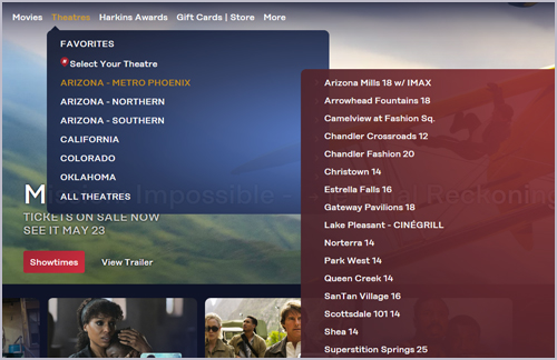
- Originally I was brought aboard Harkins to help clean up the mess their former agency had left behind. An external organization had begun the sizeable task of a full site and app redesign. But they dropped the ball and were subsequently let go, opening the door for our internal team to take over. A particular sticking point was the navigation, one of the first projects I was assigned. Beyond missing the desired aesthetics, it was cumbersome and lacked the necessary scalability for a quickly growing company. In short, all regions and individual theater locations had been dumped into the same "bucket" without a cohesive hierarchy.
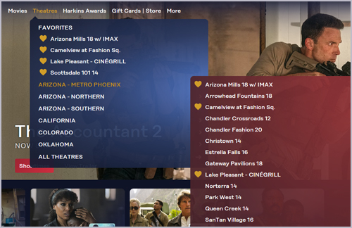
- A second problem was the differentiation of nav treatment for general users versus loyalty club members. Harkins Awards members have the option of designating theaters as "favorites", which were to appear above the rest when signed-in. But they were duplicated among the general nav choices without the designation, creating confusion.
- Last, but not least, were the nav background colors. Always a fun topic, especially taking into account subjectivity. And no, there was not a brand standards guide (although I did create a much-needed Harkins Web Style Guide during my time). There were standard colors, but the executive team was partial to a non-standard spotlight treatment for each dropdown.
Approach
- Adding the missing brand colors was an easy aesthetic fix (balancing their gradations and opacity for the spotlight effect, Challenge #3, not as much). Another obvious solution, in my assessment, was assigning regions to the primary navigation and their respective theater locations to secondary. Although the executive team was at first hesitant to commit to the separation, the cleaner organization, greater ease-of-use and increased room for growth (demonstrated in the prototypes) ultimately won them over.
- For the problematic duplication of favorite theaters, the mild confusion mostly involved inconsistent "favorite" designation. A straightforward solution was the addition of an icon, specifically the Harkins gold heart. Making it the official checkmark for favorites, both in the list and among the secondary nav locations, clearly highlighted them as such in all circumstances.
- The final hurdle was application of the Harkins spotlight effect, a static representation of a movie premiere searchlight. Used sparingly on the old site, there were few references. Regardless, utilizing it for the navigation backgrounds required specific calibration. Given all the device nuances and variations, a fully-coded version needed to be presented, with real-time modifications made, to secure final executive team approval.
Results
Being one of the first Harkins site redesign projects I tackled, dialing in the navigation served as a top-down approach to the overall effort. It set the stage, so to speak, for numerous tasks that followed and remained mostly true to design post launch.
Copyright in www.harkins.com is held by Harkins Reel Deals, L.L.C. Harkins® and Camelview® are registered trademarks of Dan’s Moviola, L.L.C.